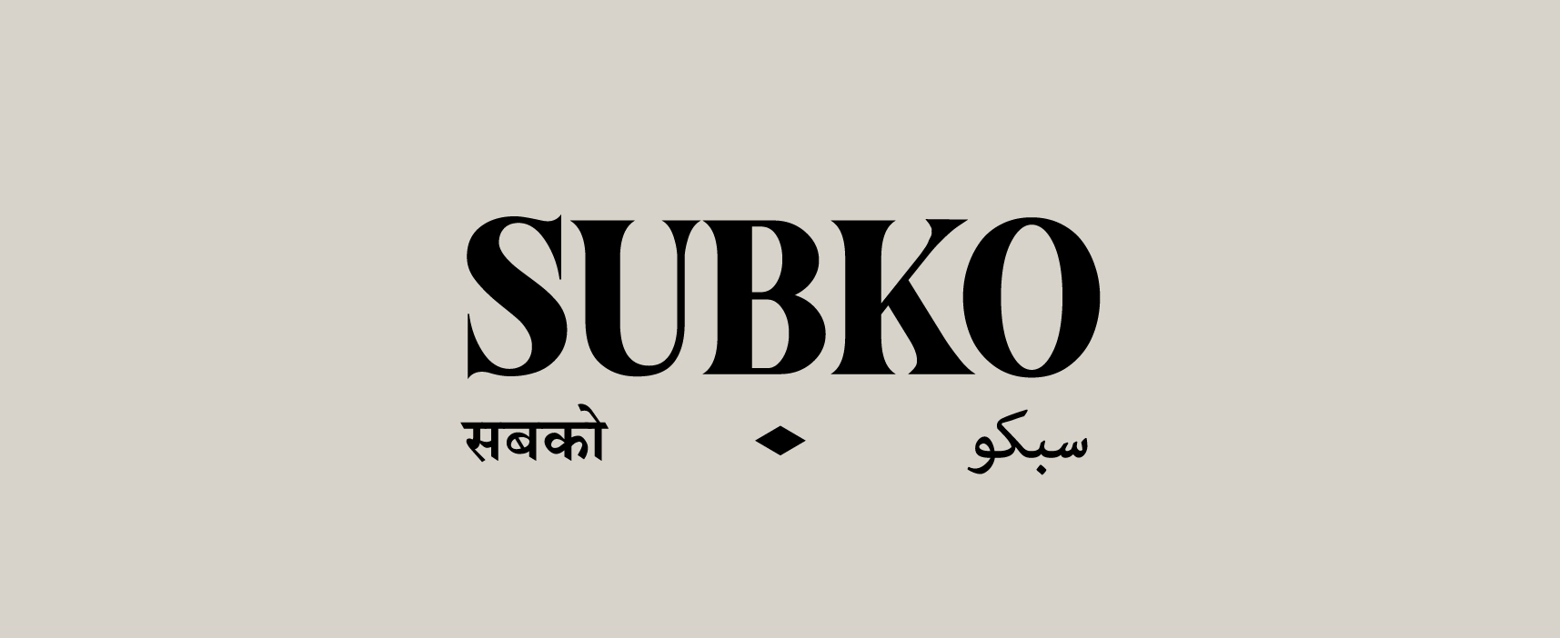
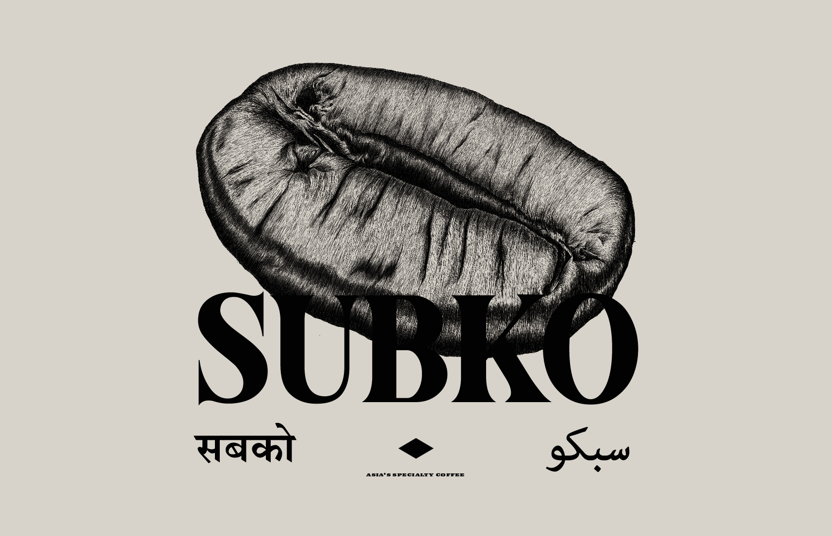
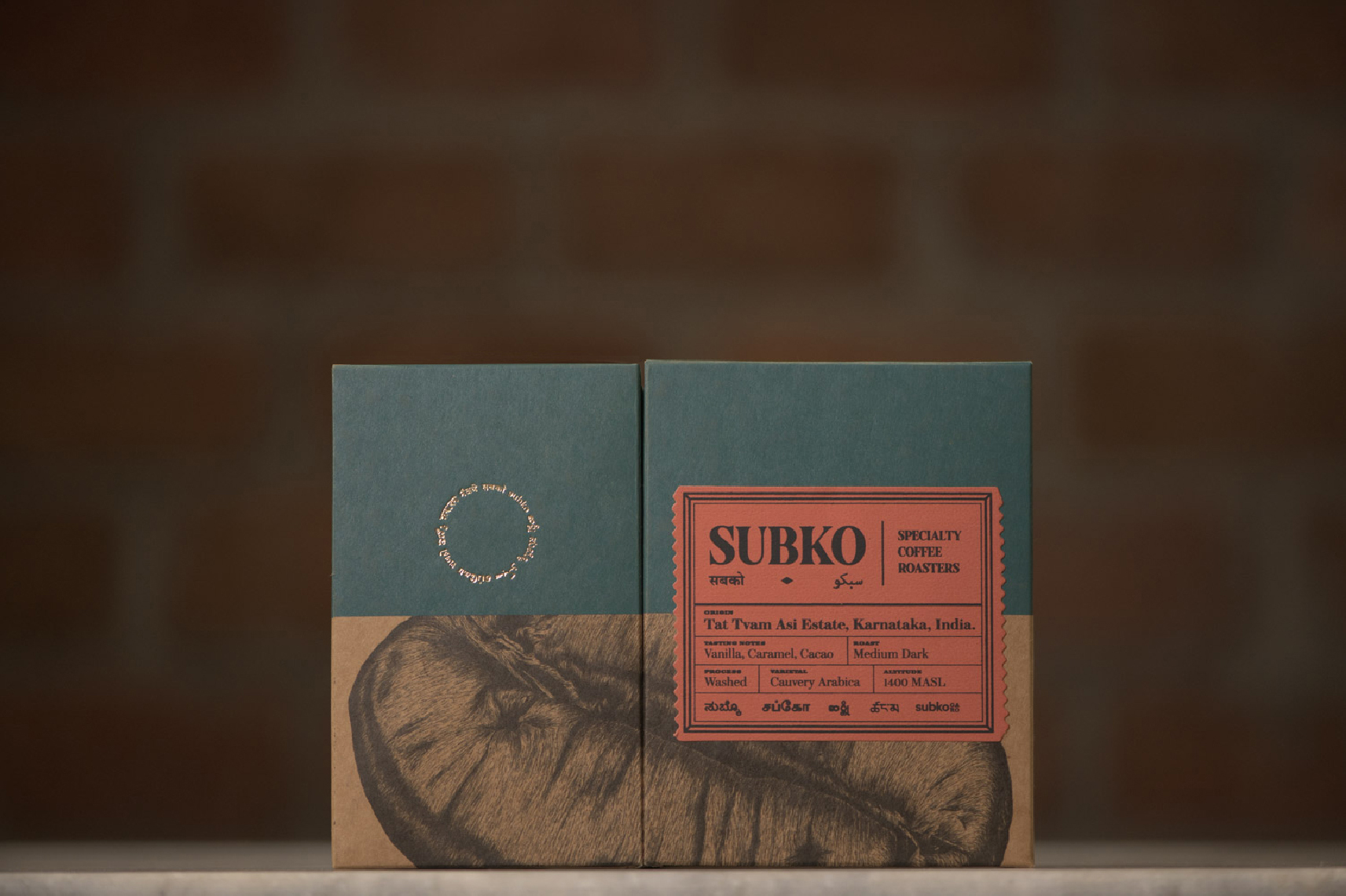
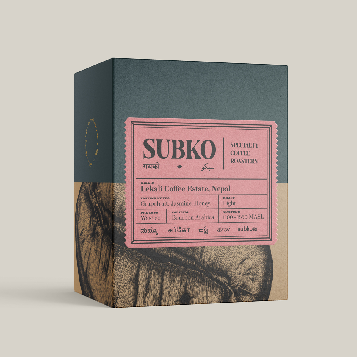
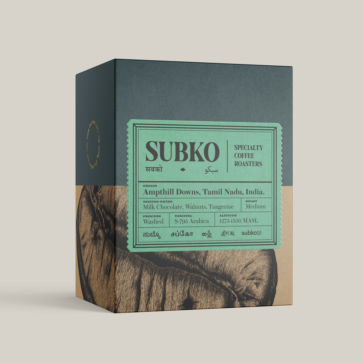
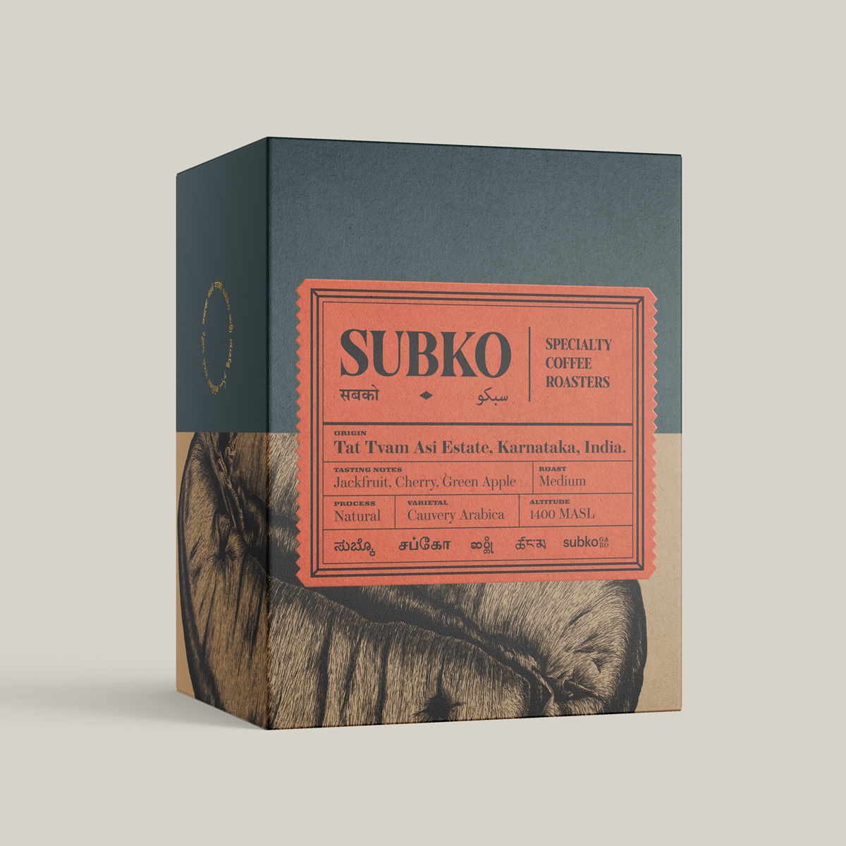
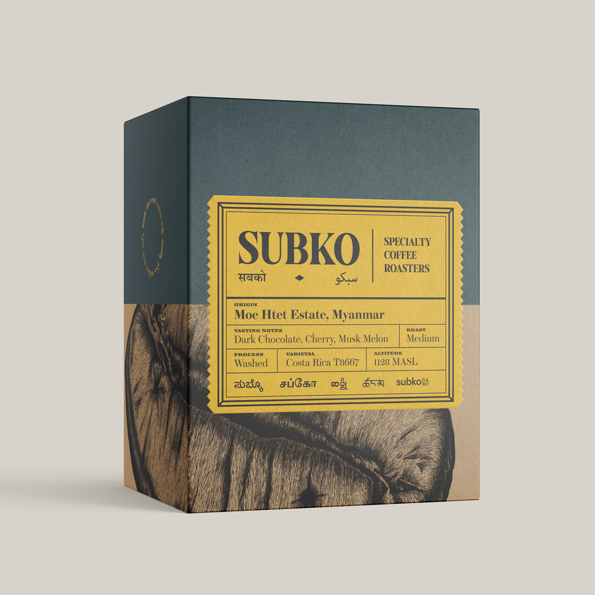
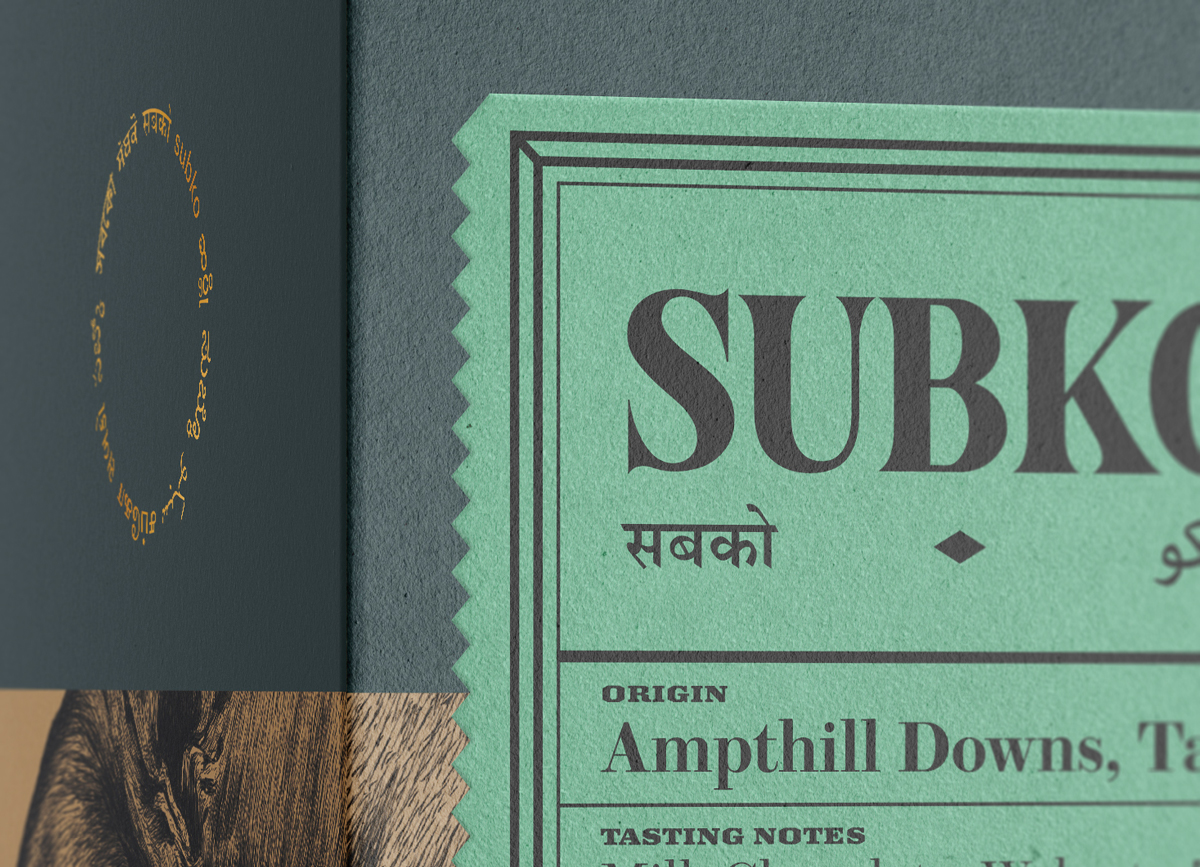
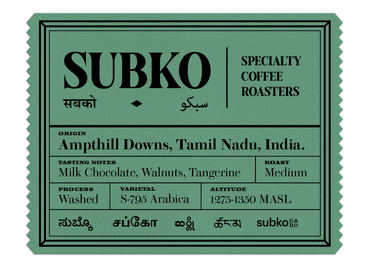
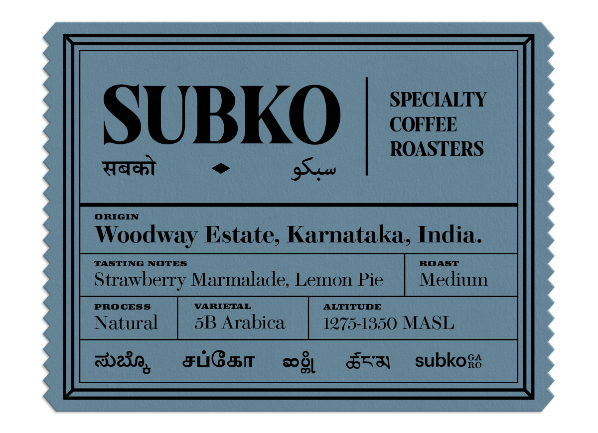
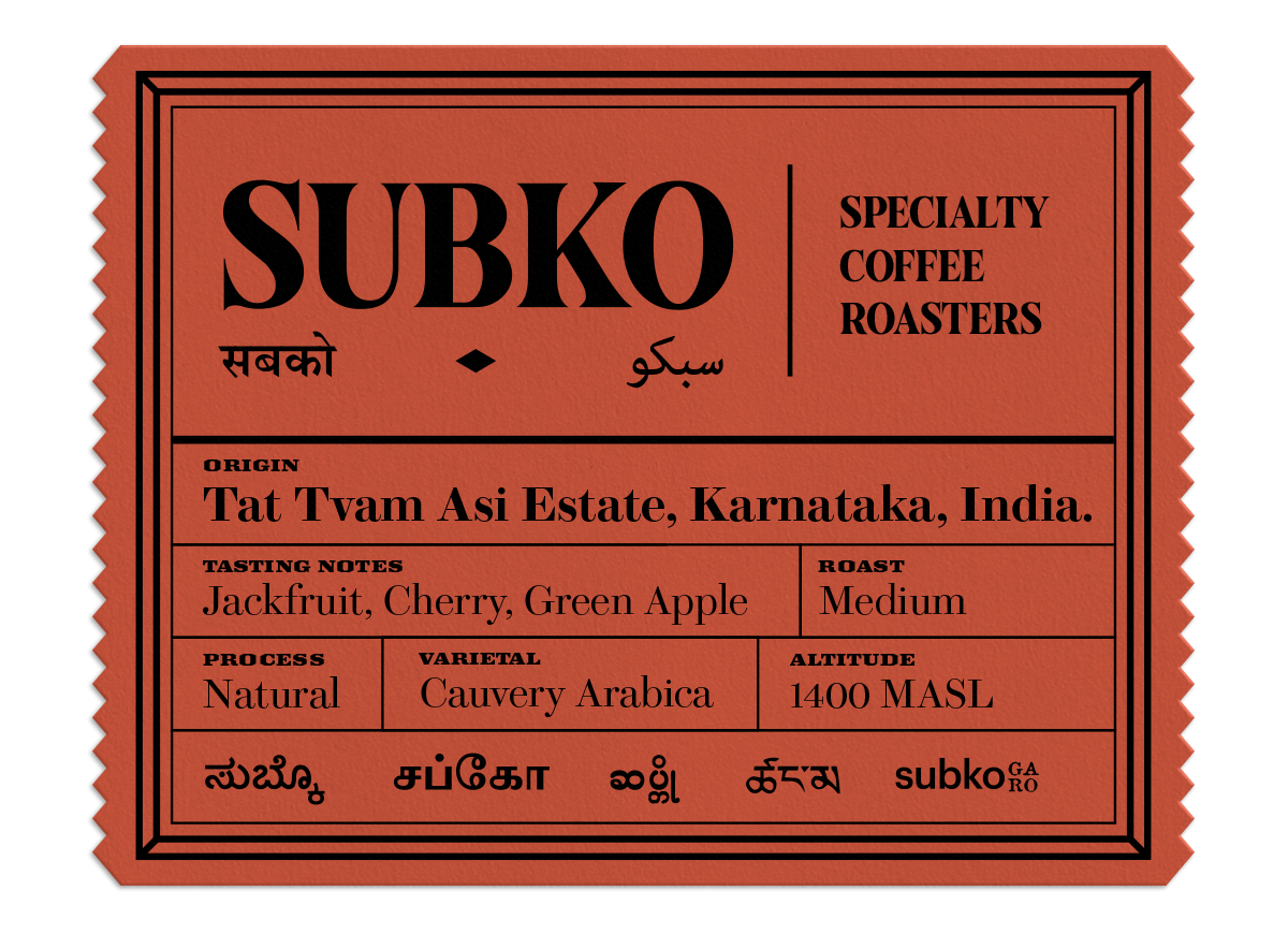
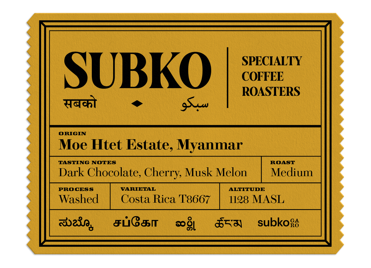
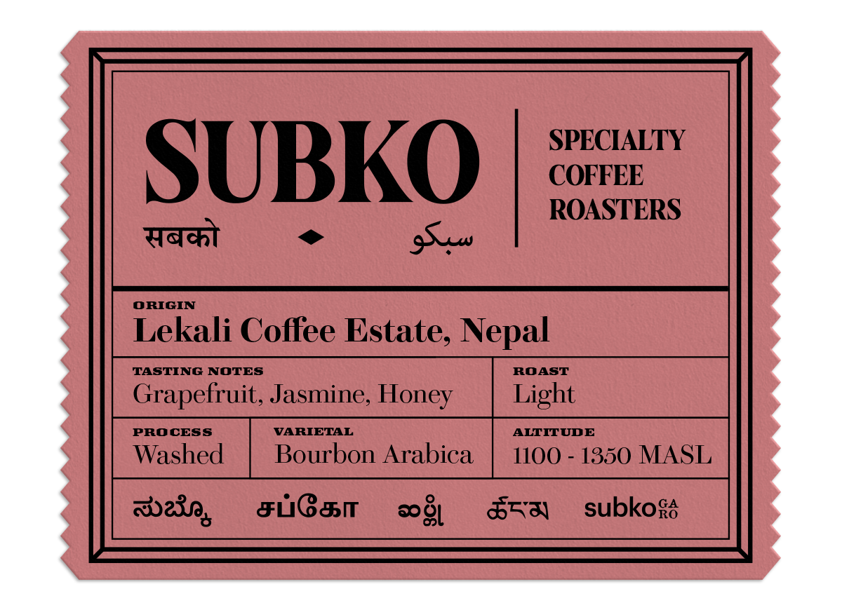
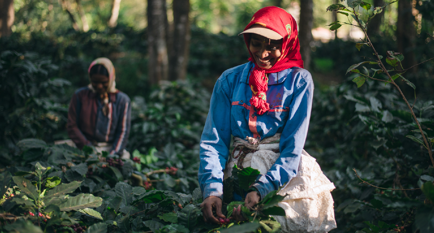
'Subko' is a play on words. 'Sabko' in the Hindustani linguistic register translates to 'for everyone' or 'for all'. We then decided to shift the spelling of 'Sabko' with a 'U' to represent pride in the Indian subcontinent as a region, bringing to life the portmanteau term 'Subko': from the subcontinent.
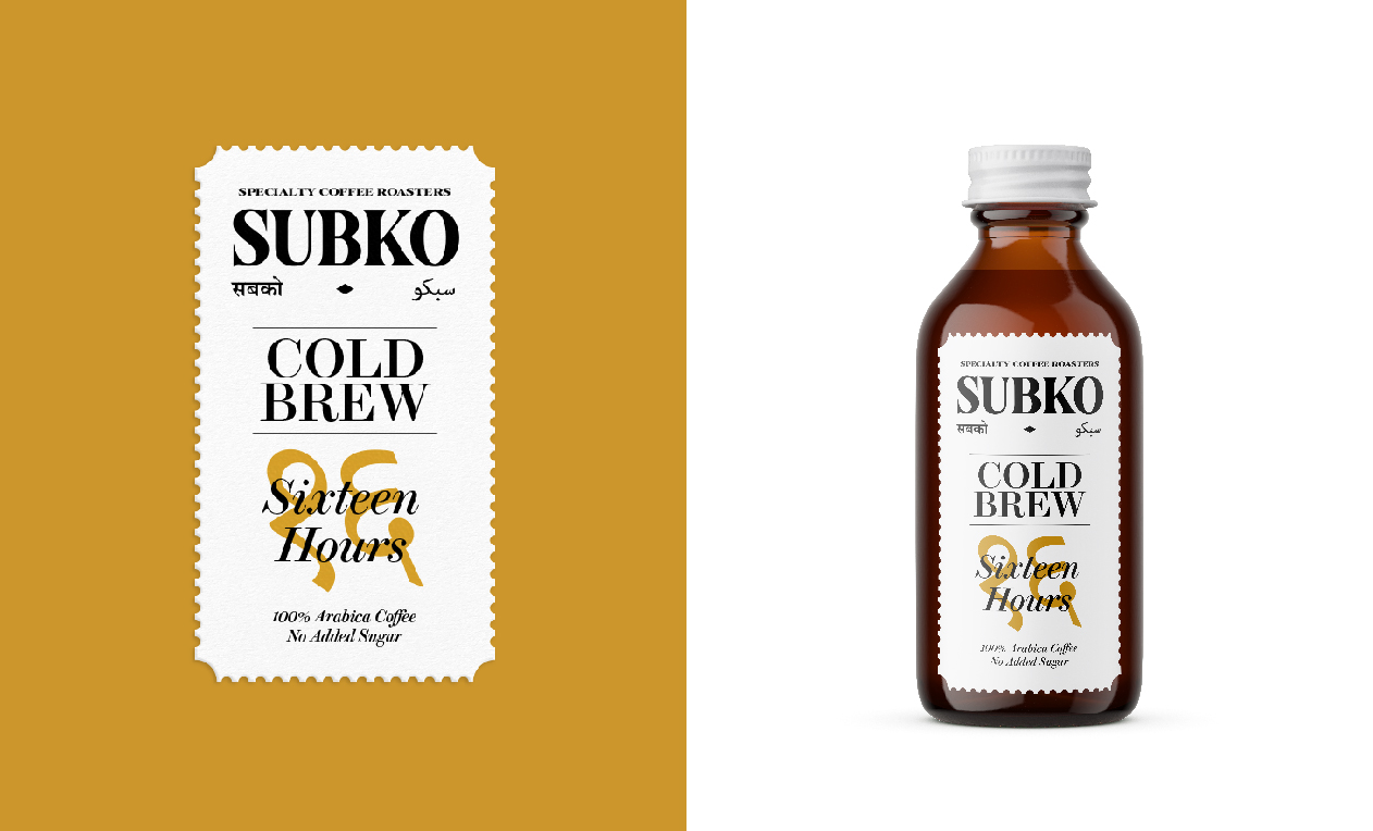
As an Asian brand representing the Indian subcontinent, we felt that linguistic diversity is one of the unique markers of the region's rich diversity and 'composite' culture developed over millenia.Our team saw three broad (but certainly not sole) cultural representations of the modern Indian subcontinent as the Latin script (English), Devanagari script (upon which many Sanskrit origin Indian languages are based), and Nastaliq script (Persian origin calligraphy seen in written Urdu language).
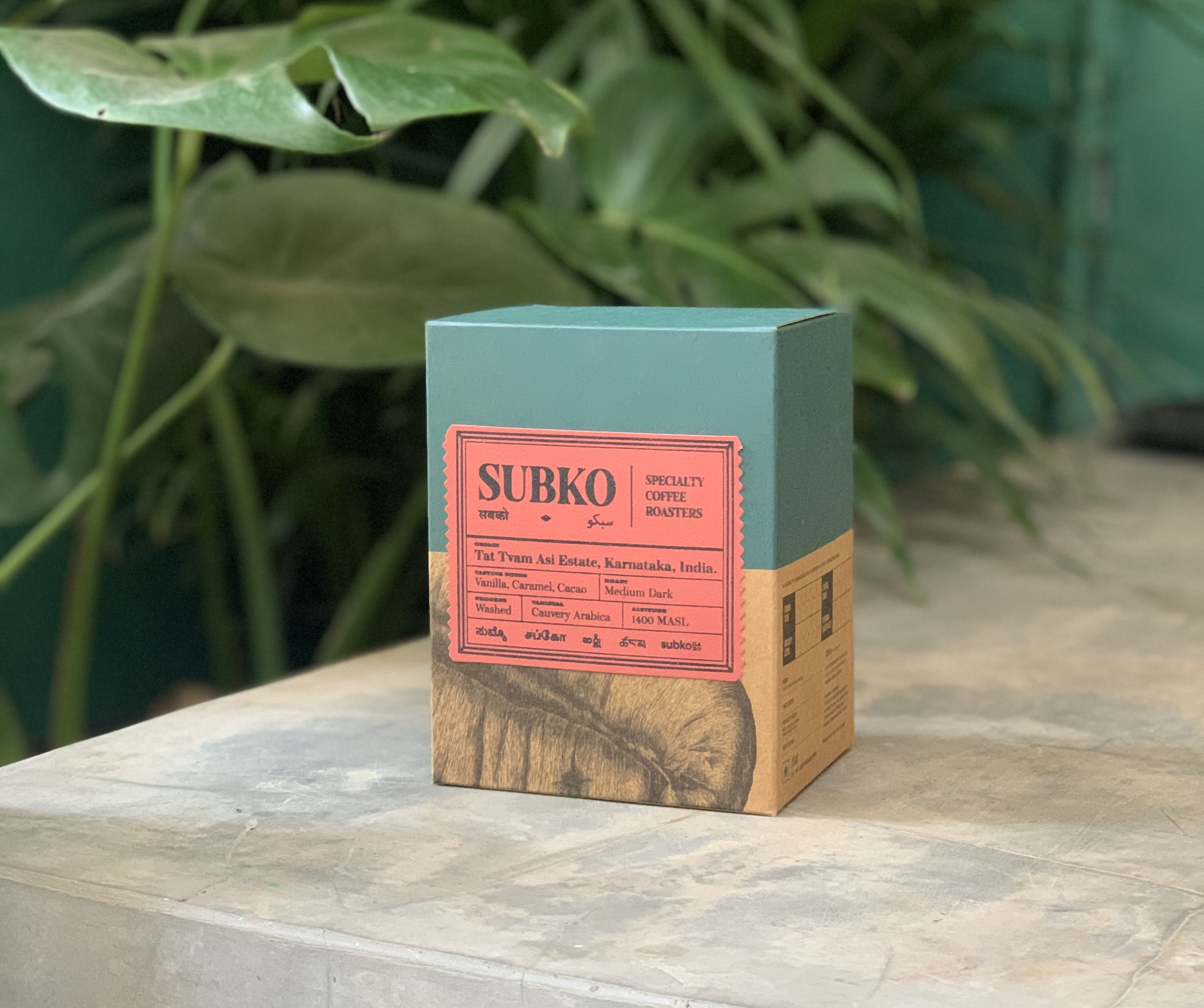
The mission was to fuse the ‘contemporary’ and the ‘vintage’. To create an identity that truly localises specialty coffee and bread from this part of the world. The synthesis of a global mindset that‘s proudly rooted in local practices. ‘From the subcontinent, for all’.
As an Asian brand representing the Indian subcontinent, we felt that linguistic diversity is one of the unique markers of the region's rich diversity and 'composite' culture developed over millenia.Our team saw three broad (but certainly not sole) cultural representations of the modern Indian subcontinent as the Latin script (English), Devanagari script (upon which many Sanskrit origin Indian languages are based), and Nastaliq script (Persian origin calligraphy seen in written Urdu language).
The mission was to fuse the ‘contemporary’ and the ‘vintage’. To create an identity that truly localises specialty coffee and bread from this part of the world. The synthesis of a global mindset that‘s proudly rooted in local practices. ‘From the subcontinent, for all’.


Project Featured on:
Packaging of the World - Link to Article

World Brand Design Society - Link to Article

Team:
Brand Conceptualisation: Rahul Reddy
Creative Direction, Graphic Design: Aniruddh Mehta (Studio Bigfat)
Brand Advisor: Karthik Natarajan
Print Partner: Azhar Kothawala (Prise Print)
Coffee Bean and Croissant Illustration by Anuranjini Singh
Design Assistance by Radhika Sawla
Photography by Parizad D
Architecture and Interior Design by STaND Design
Follow Subko Coffee on Instagram.
© Subko Coffee
Packaging of the World - Link to Article
World Brand Design Society - Link to Article
Team:
Brand Conceptualisation: Rahul Reddy
Creative Direction, Graphic Design: Aniruddh Mehta (Studio Bigfat)
Brand Advisor: Karthik Natarajan
Print Partner: Azhar Kothawala (Prise Print)
Coffee Bean and Croissant Illustration by Anuranjini Singh
Design Assistance by Radhika Sawla
Photography by Parizad D
Architecture and Interior Design by STaND Design
Follow Subko Coffee on Instagram.
© Subko Coffee